Overview
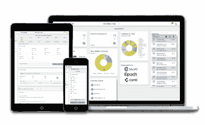
I was responsible for the research, interaction design, visual design and branding for a web‑based application for new client intake and risk management as a tool for law firms and legal teams.
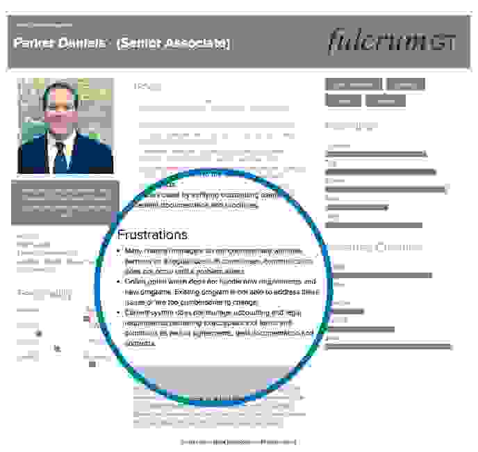
User Personas
Additional Information
Insights from our discovery work indicated many areas where a web-based solution could help to improve the day-to-day lives of AHPs.
We discovered that while information was essential, it was only one dimension in providing effective care for clients.
If we truly wanted to make a difference to the lives of law firms and legal professionals we needed to provide a more holistic solution that considered our users needs relating to:
- fully automated and flexible workflows which streamline formerly manual business processes and optimize efficiency.
- allows for complete registration on any device at any time
- implementing best practice acceptance workflows pertinent to legal firms
These insights began pointing to a web-based solution with intelligent workflows which also simplified compliance with AML and KYC standards while adhering to firm policies and standards becomes more scalable.
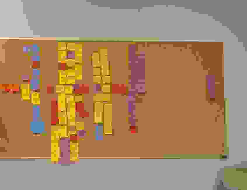
Task Flows
In the next step, I worked closely with the client to establish a data inventory. Based on this, relationships between various features were identified. This knowledge was used to develop content flow diagrams.
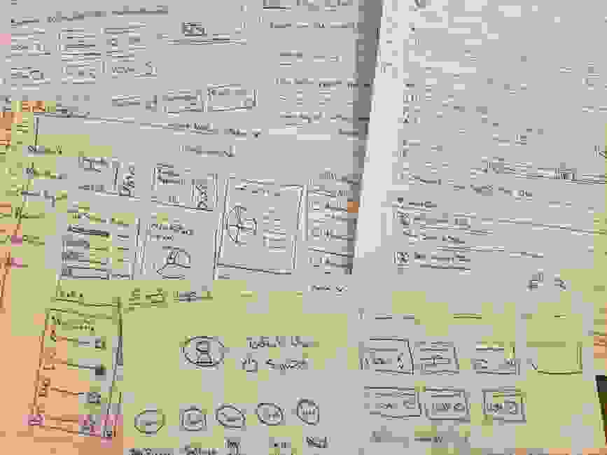
Sketching Interfaces
After validating task flows, I started work on user interface. I find pen and paper to be the most efficient medium for fleshing out ideas.
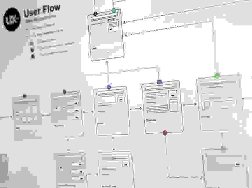
Wireframes
Low fidelity sketches, notes and scribbles together formed the foundation for wireframe development. At this stage, I started identifying element behaviour and interaction patterns. Task flows were further broken down and local actions are specified. Most of the wireframes were annotated to show links to overall product goals.
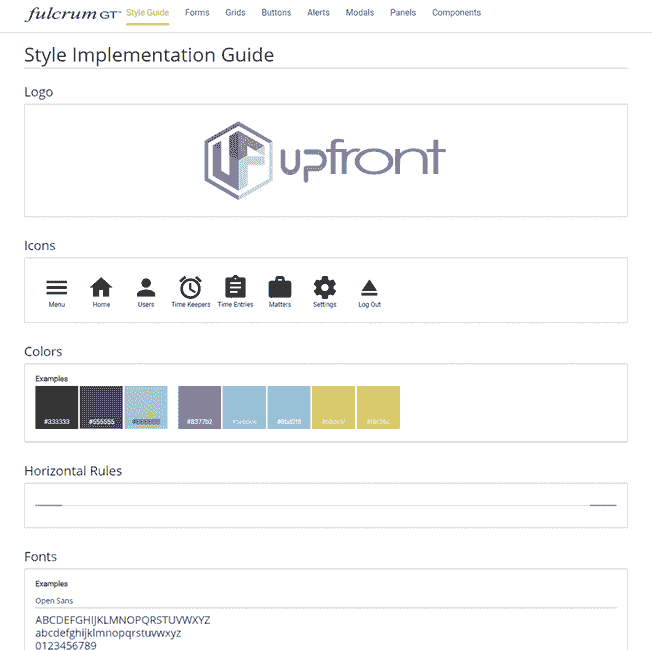
Visual Design
Once the skeleton of the product was ready and approved, I came up with a design system to set the right tone for the product. The backend for this product relied on the SAP Fiori framework so I was able to leverage this as a starting point and build upon this to develop the components, icons and overall experience.
Color
Purple and Teal are used as primary colors with Lime Green as a secondary color. The look creates an aura of optimism and energy. It's used to make the brand look very confident in it's skin making it suitable for a target group of young audience.
Typography
Open source grotesque typeface "Open Sans" is used to reinforce the language of "informal confidence."