Overview
This was a short project where I was the liaison between the design + development team to ensure top notch UX. They needed a UX expert to review current implementations and make recommendations and assist with ongoing enhancements.
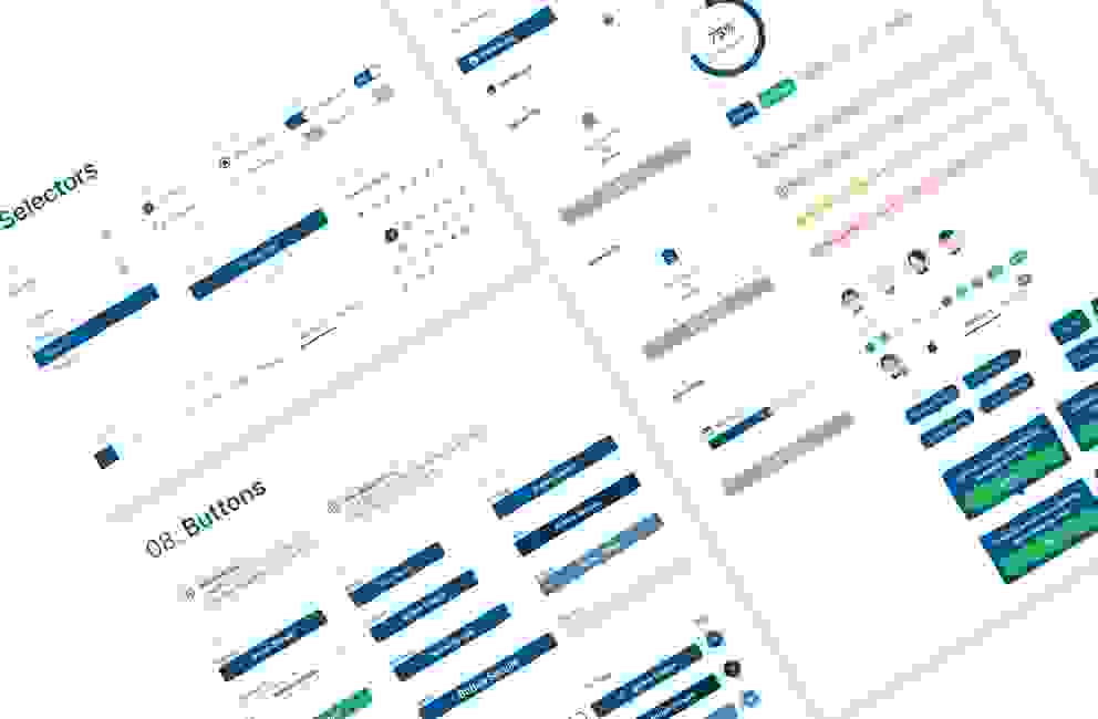
I was able to implement the basic design elements of Atomic Design to ensure consistency and allow unlimited scalability for the Design System.
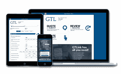
Once the design system had been fleshed out, I was able to apply this to their Agent Portal application for a responsive, modern aesthetic which provided increased usability for their agents.
One of the biggest elements I introduced to the Agent Portal application was the implementation of a "progress bar" at the top of the screen which informed agents of how close they are to completing a set of tasks by showing percentages of completion along the way.
Visual Design
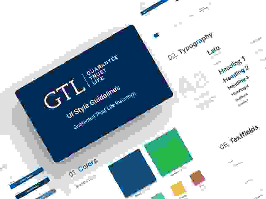
I built the design system around GTL's logo and existing design ques from their website.
The design system is based on Google’s Material Design guidelines. This is created to bring a unified user experience across various devices, platforms and input methods. This is intended to ensure that, regardless of how users are accessing the application, they would have a consistent user experience.
By implementing the developed Style Guide which establishes consistent guidelines for typography, grids, space, scale, color and imagery, we are attempting to create an intentional environment for the user with hierarchy, meaning, brand aesthetic and focus in the end result. This will help by increasing consistencies and efficiencies and aid in smoothing out GTL’s operations when included as part of the design and development process while simultaneously working with existing coded components and providing for current and future development by increasing efficiency at scale.
The Design System is a collection of reusable components. These components form the key elements of GTL’s interactive projects. It acts as a single source of truth for the building blocks of design, development, and the user experience, including (but not limited to):
- Foundations: brands colors; typefaces; icons; grids etc.
- Components: buttons; form fields; menus etc.
- Patterns: common page layouts; combinations of components
- Assets: icons; brand photography; illustrations Accessibility standards
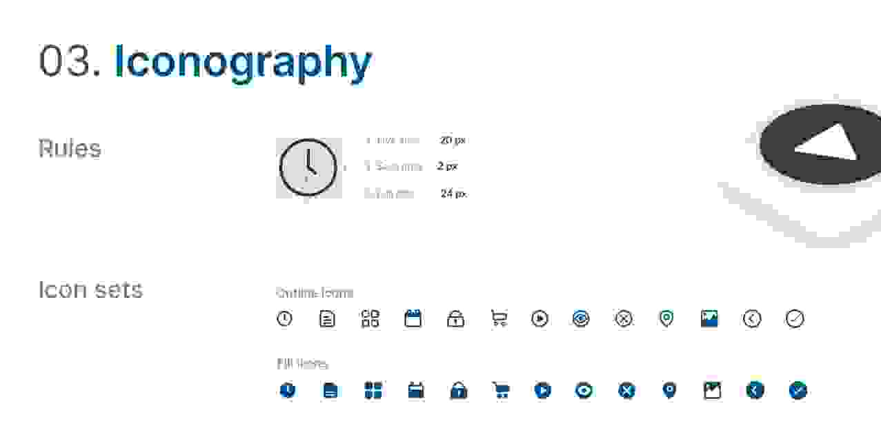
Icon Set